

IntelliWidgets
Overview
Section titled “Overview”The IntelliProve Widgets (V3) are built using web components, a native web standard for creating reusable, self-contained UI elements. These widgets are essentially exposed as custom HTML elements that can be used directly in your markup. Widgets are modular, meaning each web components is in itself often times made up of other web components. IntelliProve also provide access to these subcomponents, for even more flexibility.
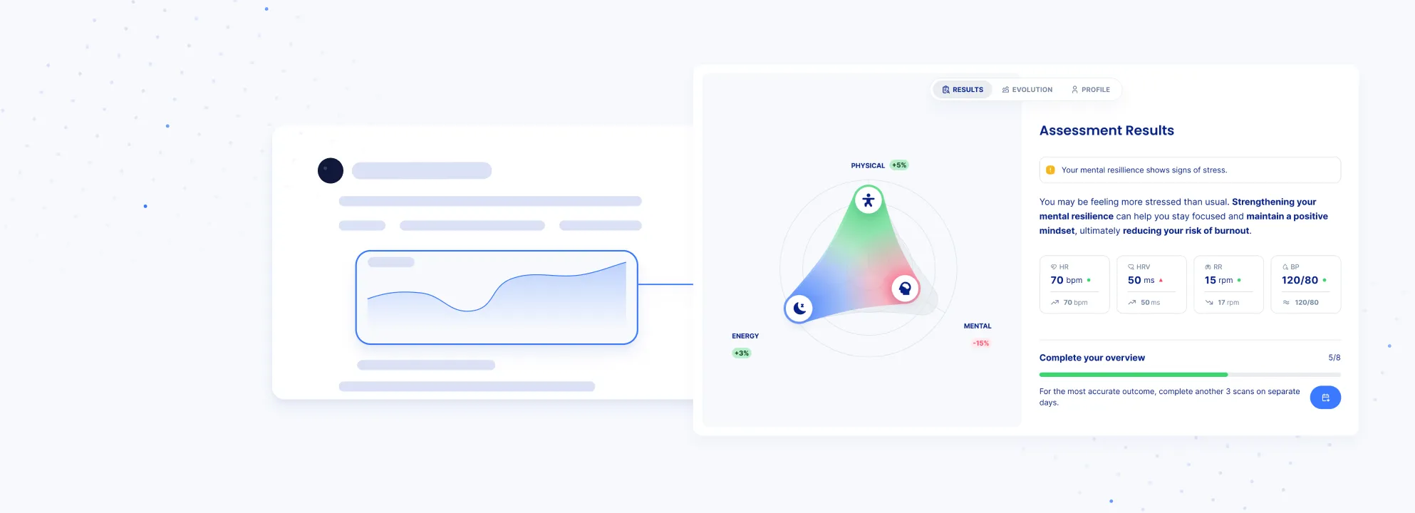
Main Widget
Quickly let the user assess their overall health status with a clear, at-a-glance summary.

Recommendations Widget
Show personalised recommendations to your users based on real-time health data.

To-dos Widget
Present users with personalized, seasonal health tasks.
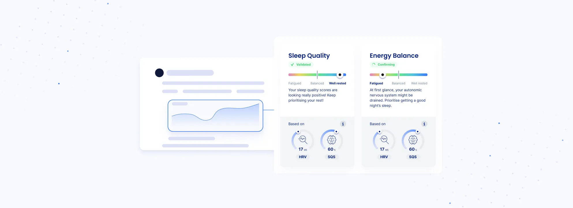
Metric Widget
Display a broader interpretation based on data collected over an extended period.
Features
Section titled “Features”Web components are standards-based, reusable UI building blocks supported by all modern browsers. They can be used across frameworks and provide strong encapsulation, helping prevent styling and behavior conflicts.
- Custom, reusable HTML elements
Use the components in any framework (React, Vue, Angular) or in plain HTML. - Encapsulated styling with Shadow DOM
Component styles don’t leak out, and your application’s CSS won’t unexpectedly affect the widget. - Scalable foundation
Designed to grow over time, making it easy to introduce new components without breaking existing integrations. Each components is made up of subcomponents that can be integrated in the same way. - Configurable and extensible APIs
Configure behavior via properties and listen to events to integrate the components into your application flow.
Missing something? Want a new component? Contact us.